
In September 1987, Digital Equipment Corporation employee Ned Batchelder created a version of the Digital logo using Adobe Illustrator, from photographic masters provided by the Graphic Design Group. In November he converted this to a PostScript Type 3 font, which was then used in delivered documentation. Here is what he discovered about the history of the logo, in his words:
The logo was designed in 1957 by Elliot [sic] Hendrickson,¹ who was then working as an independent designer. He was contracted by DEC to do a brochure, and DEC wanted a logo to accompany it. The logo up to then had been the letters DEC in blocks the shape of the plug-in cards that DEC had been producing. Elliot re-worked the logo, incorporating letters which were hand-drawn for the purpose by Arthur Hover(?)². The logo has been maintained since then in conventional technology, i.e. film masters. There was at least one reworking of the logo at some point.
The masters I received had a number of interesting features. The boxes were not all the same width, and there seemed to be no logic to which boxes were wider. The ‘g’ was the narrowest, and the ‘i’ and ‘l’ were second widest. Also, the two ‘i’s were not exactly the same shape. On ten-inch masters, (one box to an 8"×11" sheet), the boxes were not rectangles, but were very slightly tapered in wierd ways. I assume that the tapering is the result of too many reproductions, but the difference in widths may have been deliberate at some time. Elliot reports that when he drew it, all boxes were the same width. I have made all of the boxes the same width, since that seems to have been the original intent, since the differences were almost negligible anyway, and since there was no logic to the differences.
In fact, in the earliest versions of the Type 3 font, Ned kept the uneven box widths as they appeared on the photographic masters, but he straightened them in one of his later design tweaks.
 If you search Google’s archive of USENET postings, you’ll
see occasional suggestions that the typeface in the Digital logo is Helvetica.
In fact, Max Miedinger’s typeface was created in the same year as the logo, but the two
are different, as Elliott said. The confusion perhaps arises for two reasons:
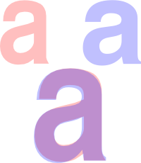
In general, the letters of the logotype have more constant stroke widths than Helvetica. The clearest difference between the two can be seen in the “a”, where the top of the bowl joins the stem. A comparison between the two is shown on the right. I had to compress the Helvetica Bold “a” (blue) to get a similar width for the overlay.
 The earliest use of this logo that I could find online was in a PDP-1 brochure,
Programmed Data Processor,
dated March 1961. Oddly enough, an earlier DEC logo was used on the PDP-1 console, seen at the right.
This brochure, and others produced in the early 1960s, show several different treatments of the same logo. The front cover of the 1961 brochure has the logo rendered in orange and red, and the back cover has an outline version.

The 1960s brochures were produced before corporate guidelines were introduced that said how the logo should be used. When Ned redrew the logo thirty years later, the red and orange sixties psychedelia had been recanted:
Only use this logo within the guidelines of the Corporate Identity program. If you use this font precisely as is, you can’t get in much trouble. Don’t take the shapes and do strange things with them. In particular, the Identity states that the logo is a one-color logo: the letters are actually holes in the blocks, through which the background can be seen. Do not modify this code so that the letters are always white.
At some point in the 1990s, the Digital logo was reworked so that the ‘i’s had circular dots and other strokes ended at a jaunty angle. Ooh, smell the modernity.

However, in 1998, a much worse fate was to befall the logo (and company) when a far more radical redesign took place:
Elliott Norwood Hendrickson (1921‒2001) was a freelance designer for several years before becoming an art director at DEC. He retired in 1988. His first name has two “t”s.
I have not managed to trace Arthur, as of 2023.